Daily designer news |

- 5 responsive frameworks for more productive web design
- Featured illustrator: Rafael Alvarez
- Street art in Fort de France, Martinique
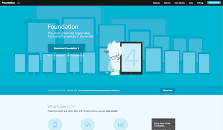
| 5 responsive frameworks for more productive web design Posted: 27 May 2013 03:27 PM PDT If you are not using a CSS framework in your current workflow, you should seriously consider it. To work with a framework, you will of course need to learn how to use it, but once you learned the advantages are quite huge. Not only working with a framework will let you build websites faster, but it will also encourage you pay more attention to things some web designers overlook, like using a grid, including a print stylesheet, or making your site responsive, among other things. Now let’s take a look at the best and most popular CSS frameworks. 1. FoundationMy personal favorite and weapon of choice. Foundation provides you with a great, flexible grid that can easily be nested. It also focuses on mobile and lets you build sites that are mobile first, then add the stuff for other versions, making the mobile version really optimized and un-cluttered. It also works very well for rapid prototyping, making it a useful tool for more than just designing your site.
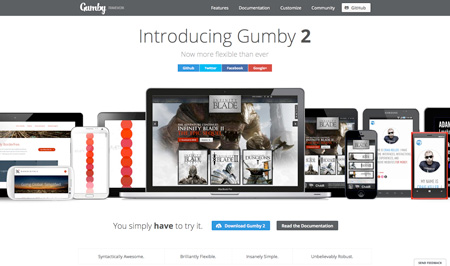
2. GumbyGumby uses a flexible, customizable, 960px wide grid, a width chosen by many web designers. It also uses SASS, aka Synctactically Awesome StyleSheets, an extension of CSS3 that adds nested rules, variables, mixins, selector inheritance, and more. Finally, Gumby is perfect to create clutter-free responsive site, no unnecessary stylesheet on the tablet version of your site.
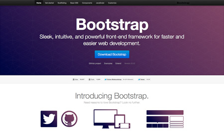
3. BootstrapBuilt at Twitter, Bootstrap has become the most popular framework and now powers an impressive number of websites. It is probably the most feature-heavy framework in this list and allows you to build pretty much anything you want. Create fixed or fluid grid-based layout becomes easy, as well as making your designs responsive and mobile-friendly.
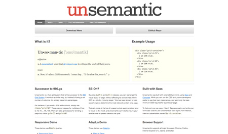
4. UnsemanticUnsemantic is the successor to the 960 grid system. It is built with Sass and Compass, works well for responsive websites and uses Adapt.js. It is also cross-browsers and focuses on SEO by helping search engines determine the most relevant content on a page.
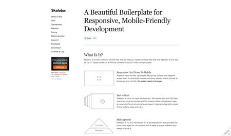
5. SkeletonSkeleton is more of a development kit than really a framework. It was created for rapid web development, with all the typographic, grid, buttons or form tools you’ll need.
|
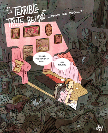
| Featured illustrator: Rafael Alvarez Posted: 27 May 2013 03:24 PM PDT
Rafael Alvarez is an illustrator based in NYC. Personally I’m a very big fan of his editorial illustration work.
|
| Street art in Fort de France, Martinique Posted: 27 May 2013 03:17 PM PDT
An awesome piece of art that perfectly takes advantage of the context it’s in. It was created by Nuxuno Xän in Fort de France, Martinique. Via Street Art Utopia. |


| You are subscribed to email updates from Design daily news To stop receiving these emails, you may unsubscribe now. | Email delivery powered by Google |
| Google Inc., 20 West Kinzie, Chicago IL USA 60610 | |
ไม่มีความคิดเห็น:
แสดงความคิดเห็น